I have a section with many images (I’m going to use parallax), when I shrink the screen all the images are coming to the center and it looks bad, instead I want for it to simply be cut by the screen (cancel responsiveness?)
Wow! it worked:open_mouth:
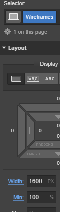
Thanks for you help and patient but now I wondering why it worked… could you explain it to me? Why did I put a div inside the section? why 1600px? and why now the images are not moving?
I really appreciate your help.
So anyway, the method to keep things not scale down (as you wanted it to be - just cut from one side or another) is to give them some size that will not decrease (hence we put in 1600px - but that could be any number at which you think your element looks the way it should - at the same time you set minimum width of 100% to ensure that this element is always at least the size of a browser width preventing it from being too narrow on wider screens).
Now if this element is larger that our browser window width it will create a horizontal scrollbar. To avoid this we usually set overflow: hidden on the parent element.
But the element you needed to keep larger that browser width was a top level section so there was no parent to give it the overflow: hidden property (aside from the body, but that would be a bad idea). That is why we had to create yet another div inside, style it to keep it wide and take 100% of its container, and then gave the overflow setting to its parent (that’s our section!).

 but now I wondering why it worked… could you explain it to me? Why did I put a div inside the section? why 1600px? and why now the images are not moving?