Hi everyone! I wanted to let you know that we’ll be pushing an update to the Flexbox UI in the coming days. The changes make the UI simpler and more intuitive for new and existing users. I’ll outline all the changes below:
Updates to Flex Container UI
The horizontal and vertical direction buttons are moved into its own row, above the distribution and alignment actions/icons. Choosing the direction is usually the first and most important action, so it deserves a more dedicated space. This layout also gives all the buttons more breathing room so its easier to understand at a glance.
We moved the Flex Item section above the Display Settings section. It’s more specific to the selected element so it should be higher in the list. We will be following this pattern for all of our components as well.
Flex item alignment and order overrides will be hidden under a checkbox. They shouldn’t be used often so we’re hiding the UI more. Simplifying this section also helps to differentiate Flex Item settings from Flex Container settings.
You can hover over the icon on the left of the Flex Item label to view the Flex Container on the canvas. Clicking on this icon will take you to the Flex Container where you can edit the layout. We will be applying a similar pattern for other components that have a parent-child relationship.
@thesergie those are some really sensible, well thought through, changes.
It’s encouraging to see that you’re not just adding new features but also continuously improving what you already shipped. By having a great UI for flexbox in the first place, you already differentiated from pretty much all other players on the market. Fortunately for us, you don’t define yourself in relation to the competition, but to your own impeccable standards.
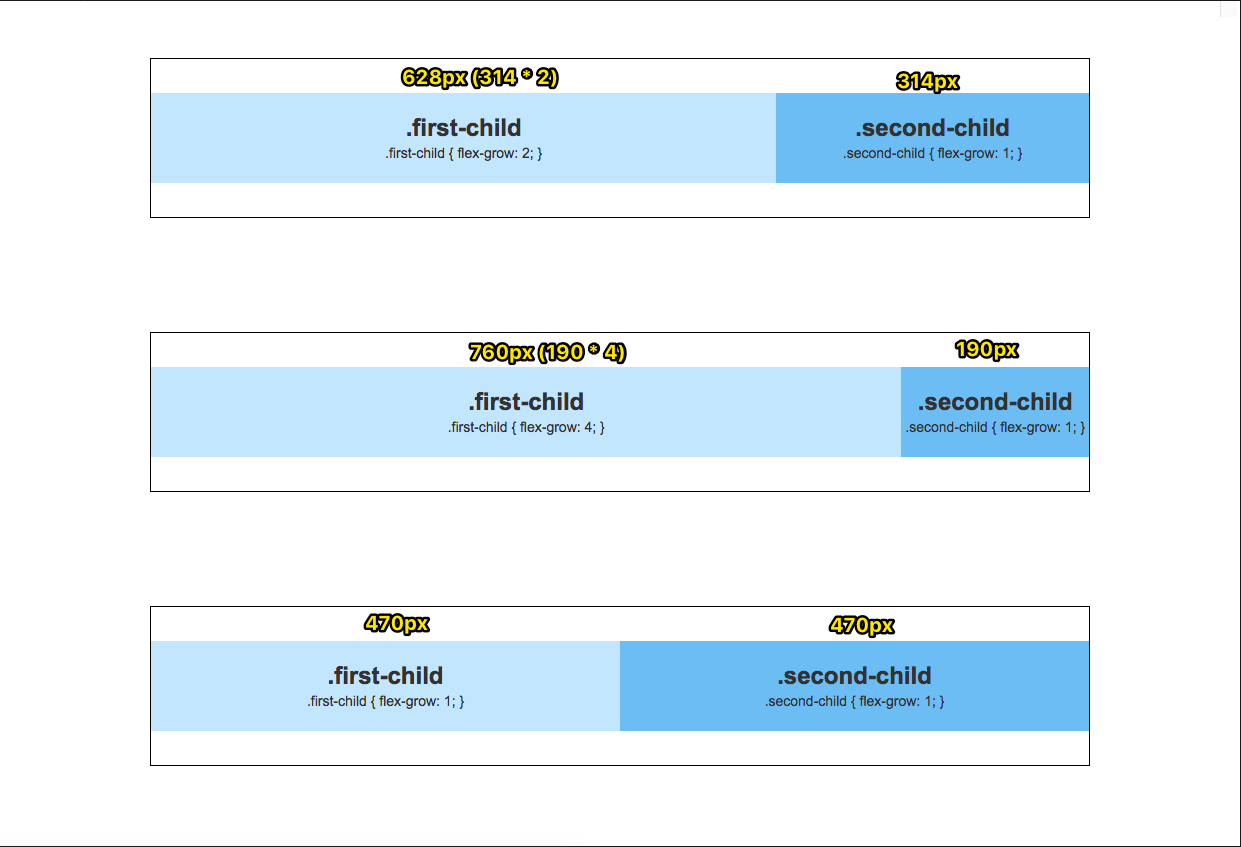
@thesergie Hey, just noticed that the Custom/Gear-icon setting for Flexbox has a slider for Grow & Shrink. I’ve treated these pretty much as booleans in the old UI, what does setting it to e.g. 10 mean?

