Hey Webflow world!
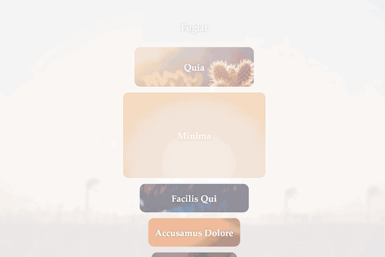
This simple experiment uses a single CMS collection list and a single interaction to create this effect. Upon scrolling these “photo cards” grow when near the center of the page and shrink as they exit. The photo inside the card is fixed as is the background photo. The two work together for a nice visual transition that keeps the eye focused on the central card.
Would love to hear thoughts and suggestion on how to smooth out the interaction. The effect is close but it could use some refinement. Clone away and see what you can do with it.
https://webflow.com/website/Vertical-Expanding-Photo-Cards?rfsn=1238407.36b81
I’m always on a quest to make the web feel more app-like with animations and micro-interactions. This was inspired from a Dribbble shot by Kévin Gautier. I chose to focus on the scrolling card interaction for now.
5 Likes
Great, nice work! In my opinion it would be nice when the picture in the background gets a little movement too when card opens or closes. Thanks for posting this.
Thanks.
Some parallax movement on the background images would be nice, but a little trickier to figure out because the fixed position is what makes the bkgd-img and card-img align. Something to think about.
This is a great start, it feels very clunky though. Needs optimization and a rework of the resizing to make it smoother. Keep at it!!!
I believe the jumpiness of the elements is because multiple items in the list are resizing on the vertical axis simultaneously. This causes elements surrounding to be pulled in/out of the scroll animation area which in turn effects their size on the vertical axis. So there is almost a feedback loop of calculations going on and the browser has a hard time calculating fast enough to keep up with the scroll position.
Any other ideas? Definitely want to keep it as a scroll trigger because a click trigger wouldn’t feel “app-like” or be as interesting.