So I’m using this code in the custom code area to hide the thumbnails in the lightbox. it seems to work fine for the most part (particularly on desktop) however, on mobile, even though the thumbnails are hidden, the space where the thumbnails used to be is still there.
I’m hoping someone can help me figure out how to get rid of the space so the lightbox image can be centered on the screen like it is on desktop.
Of course, the Ideal situation would be the Webflow guys would just give us a Show/Hide thumbnails checkbox in the lightbox settings. but for for now i’m hoping someone can provide some assistance.
Hi Bryan, the code you posed works perfectly for me on desktop at any media query. The image does not fill the height entirely (maybe 80% of height), but is vertically centered correctly. Each media query also has a max vh for how much of the window it will fill, so you could add that attribute if you want it to fill more of the window:
When I check an example on my iPad the space (or margin) for the thumbs is still there, but is correct on desktop at mobile media query sizes. I wonder if maybe there is an additional set of device detection parims for touch? I am probably missing something else entirely. Need a chrome inspector for iPad…
It looks like you will have to override vh for each media query. You may have to do the same for the margin as well? It isn’t behaving that way on desktop when testing though. Will look a bit more when I get time.
Thanks @vincent… sorry i’m not in a position to post a public link yet. But it is pretty much the standard lightbox with that custom code added. works fine on desktop but as @vlogic and you have noticed on table and phone the thumbnail space is still there pushing the lightbox image higher on the page.
@vlogic, Thanks for looking into it. this has been something i’ve been trying to figure out for some time now. I’ve tried everything i can given my limited knowledge.
Would love for one of the Webflow folks to give any thoughts or possible options.
So does this help any of you folks that know coding well?
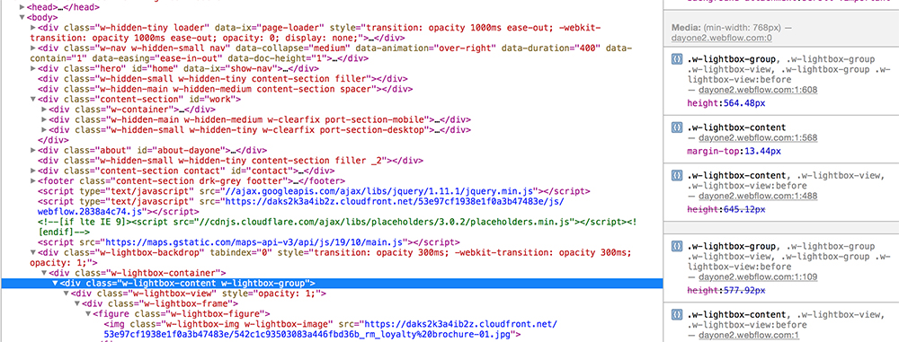
I connected to my iPad using the develop menu in safari so that I could inspect the elements. In the image attached you can see that .w-lightbox-group is set to 564.84px. when i change that to 100vh then the lightbox centers correctly.
The problem is even though i’m targeting that in my custom code, it doesn’t seem to “stick” when published (or what ever the term is)
just bumping this thread… trying to solve this before launching a site. if Webflow is not able to do this could @callmevlad or at least someone at webflow just let me know that it can’t be done so i can move on. I would be unfortunate but atlas i can stop jacking with it.
Do you think i would have better luck working directly with Webflow support?
Hi @bryantay, what you are trying to do may be possible, it is using custom code and would have to be investigated. We do not support custom code, but I am happy to take a look and see how you have this setup. If you could share the read-only link to your site to me via Private Message, I am happy to take a look.
More information about read-only links:
We do not guarantee timelines to resolve issues when working with custom code, so if you have some sort of deadline, you might consider an alternate solution that uses the supported features in Webflow, just to keep that in mind.