I am trying to create a interaction where I will have the logo(enlarged) hovering and on clicking the logo it shrinks to navbar area and the main page presents itself.
I am doing this in the following way
- I have a div which overlays the entire page on which the logo hovers.
- The div has a navbar whose logo I have enlarged.
- On clicking the logo the logo reduces in size and the div disappears.
- And the logo on the div matches exactly with the logo on the homepage
So the issue is
- In order to center the logo on the page I have to add margin to the top of the navbar and in this case I have brought the navbar down by a few pixels
- But during the shrinking of the logo the navbar needs to go back to its original place so I have to reduce the space above which is very choppy and ruins the animation.
Can someone please suggest a better way I can achieve this?
Here is my public share link: https://preview.webflow.com/preview/joy-4b0fe4?preview=8821f73883d9e99c3d089352e4577e85
(how to access public share link)
@Jonah_Kamalakar I have looked at your link but I am a bit unclear of what it is your trying to accomplish the logo in the nav for me is not clickable. following the description of what you said your doing the following way. What have you got so far update the link please.
Hey sorry about that I was making some changes and forgot to turn the loading screen back on. Have updated the link.
@Jonah_Kamalakar would mind sharing a read only link so I can see it in the editor? I know the issue I but I want to be able to give you the best solution.
@StuM thanks StuM I am still new here myself lol
1 Like
Hey I have shared the read only link. Sorry again!
@Jonah_Kamalakar Ok i have got it working for you.
First issue remove the 50px transform from the navbar and add 50px to the navbar margin top. transforms and margins are not the same.
then configure your logo animations out. I created another trigger of logo image and gave it a -50px move like this image then merged the triggers in a stack.
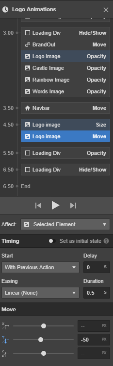
with a 0.5s just exactly like the settings in the image and it will work fine
2 Likes
Hey can you please help me how do I make sure the logo image move is different for different screen sizes?
I cannot use 50px top margin for other devices. I have to increase by 50 for other device screens to make the logo appear in the center for the other devices.
@Jonah_Kamalakar when you select the tablet view or the mobile view change the margin for that query because the margin to animate to is 0px
Hey thanks for the reply but it doesn’t seem to work because in the tablet view I have to add 100px to the navbar top margin so that the logo seems more or less in the center. Then in mobile(landscape) I have to put 150 and portrait I have to add 200.
How to change these in the interactions?
@Jonah_Kamalakar can you put a view link where i can see a live view on the webflow domain?
@Jonah_Kamalakar Ok follow these steps.
remove the logo image both from action the one i told you to create with the -50px as well as the one you had in there your loading div and your animation container after loading you want to scale them down so that it disappears in the navbar revealing only the logo in the navbar. you can scale the whole animation like a single image. then on your mobile views change the margin to what ever that way regardless the end result is 0px
1 Like