omerwaiz
(omer.waiz@gmail.com)
1
Hi
for the past week i have been struggling to do the most simplist of tasks … i want a fixed nav bar on the left side of the browser.
i have 25+ items in my navigation.
i am using the webflow library navbar.
Desktop is working the way i want it to.
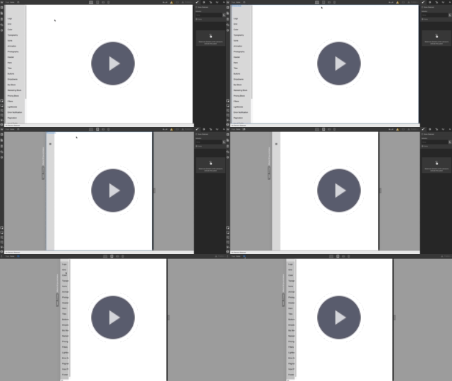
when i go to table and mobile resolutions…the open menu is getting cropped inside the nav bar.
below shows what i mean:
project share link:
https://preview.webflow.com/preview/spry?preview=b22968b9ae40bd34bfaec189a07358c2
im calling this a bug…please help
PixelGeek
(Nelson)
2
Hi there  Try setting a width to your navbar since you have an
 overflow:auto

hope this helps
omerwaiz
(omer.waiz@gmail.com)
3
Thank you.
Question.
Does this mean my closed state nav bar needs to be the same size as my open menu?
i was hoping that i could keep the navigation on tablet and below to 60px on closed state.
and when user clicks on “hamburger icon” it opens the menu and the width is wide enough that the content does not crop.
–
i tried to do a work around on another version for same site.
the only way i could solve this is with keeping the menu in “hamburger” for all breakpoints.
and then i animated in between open and close state. its not ideal…but its not cropping any information atleast
share link:
https://preview.webflow.com/preview/spry2?preview=3b30383a88fa8e83442af46c2228ce6a
–
thank you for your help
system
(system)
Closed
4
This topic was automatically closed 60 days after the last reply. New replies are no longer allowed.
