Im sorry for this really newbie question but I just cant get my head around this:
So my site has a logo image at the top of the page. Size is fine on a desktop. Not on a smaller screen, so I click on the top icons for a smaller screen, change the image size so it wont obscure the text below it, and when I check back, the desktop version changed size also.
Ive tried multiple methods to make it dynamic with size - renamed the class, copied and pasted it - nothing working for me.
Can you please explain best practice for changing content to look different on different screens ( so called responsive ) because every time I try to change my site, I get caught by this problem.
Here is my site Read-Only: LINK
(how to share your site Read-Only link)
Dear @SimonSolar2C,
The first important thing to know is that any styling changes made to a specific screen size will translate down to all smaller screen sizes but not vice versa. Meaning that any styling changes done to Desktop will affect Tablet and Mobile styles accordingly, whereas any styling changes done to Mobile, on the contrary, will not affect Tablet or Desktop styles. This is the core concept behind Webflow’s responsive design workflow.
In your case, it seems that you are not resizing your image in the right way and as such, you are probably changing the dimensions of the element itself rather than its style. For example, if you are resizing by dragging the corner of the image, this changes the element’s dimensions and not those of its css style and therefore this change would be visible on all devices, something that is not wanted.
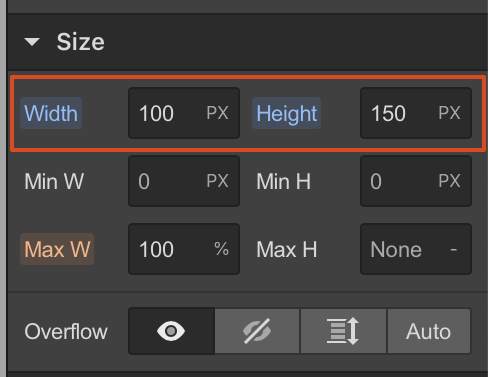
What you have to do instead, is change the dimensions of the style. In your case, you can simply do this by defining a specific width and height in pixels for your image for Desktop (see screenshot) and then defining smaller values for Tablet and Mobile, as necessary. Since you will be changing style and not the element itself, any changes done on smaller screens will not affect your desktop layout. I hope that helps! 
Thanks that helped alot - although it was setting MaxW to 100% that made the change. When I only changed the pixel height, it did nothing - see attached please. Doesnt seem intuitive
1 Like
Hi @SimonSolar2C
It seems you are making styling changes to the “Brand” link element in the screenshot above and not to the “Image 7sml” image element contained within. Changing the width and height settings of the “Image 7sml” element instead should do the trick. 
To be more specific, I have found some “problem” areas relating to the logo element that I would probably approach differently:
-
I would resize the “Brand” container (Desktop) to fit the Image precisely without any extra margin. The container currently extends above the image by 36px (if you click on the brand element and the image element you will see that their boxes have different sizes). This means that there are 36px above the image which are currently clickable, whereas you only want the area of the image to be clickable and nothing else (if you hover your mouse on the margin on top of the logo in preview you will see that the mouse will change to a clickable cursor). To fix this, remove the 36px top padding from the Image element and add it to the Brand element instead. This way, the elements will remain in the same intended position but now both elements will have exactly the same area.
-
The same principle applies on other screen sizes. Remove any top or side margin applied on the image and apply the same margins to the brand link container instead. On Tablet you can add a left margin to the Brand element of 5vw so that it is aligned with the rest of the content below.
-
I would keep the Brand element size responsive to the image size and not vice versa, so that it always fits snuggly around the image. I have noticed that you have defined a width of 55% on the brand element on the Tablet breakpoint and kept the image as auto. This has created an unwanted clickable area again on the sides of the logo. Instead, I would keep the width and height of the Brand element as auto and I would define a width in pixels for the image which I would change for each screen size breakpoint (e.g. 139px or auto for desktop, and 95px for tablet).
I hope this is helpful. Have a nice day!
