As_Gen
October 12, 2017, 1:12pm
1
Hi webflowers;)
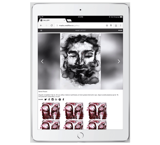
Generally speaking about GALLERY tab on my site. When open GALLERY on tablet firstly I see that:
as I designed it
but after a second or less the screen changing to that:
The issue is that the element grid with combo class “tablet” has display settings flex but it acting like a block.
publik share link: https://preview.webflow.com/preview/mashu?preview=32c2b2a0e5807c725e05fefd121bf72f
PixelGeek
October 12, 2017, 4:10pm
2
did you want all of your thumbnails in 1 row or multiple rows? Also, what tablet are you using? Here is what i see on an iPad Air 2 with Chrome:
As_Gen
October 12, 2017, 4:42pm
3
I use ASUS tablet with android and my screen absolutely the same. I want it like in disigner - one row with scrolling.
As_Gen
October 13, 2017, 2:28pm
4
Updating
as you can see elment Grid has justify: center. But when I open site on mobile it’s displaing with justify: start.
When page just loaded grid centered for a second or less and than moving left a bit.
system
December 13, 2017, 11:28am
5
This topic was automatically closed 60 days after the last reply. New replies are no longer allowed.


